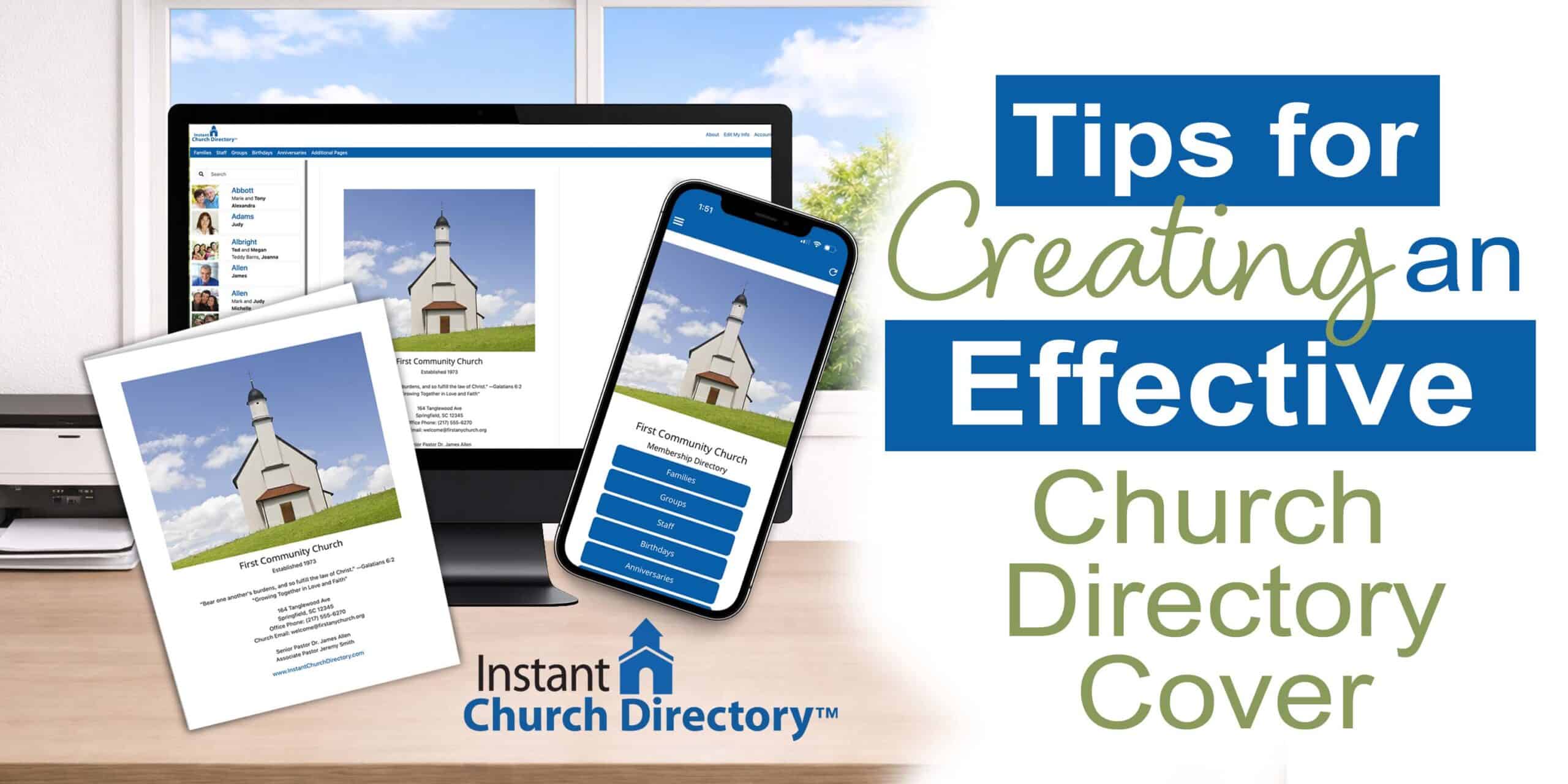
The cover of your church photo directory provides an important first impression, setting the tone for what’s inside. With Instant Church Directory’s handy built-in cover feature, you can create an attractive directory cover that works across all platforms.
This cover-building tool turns your images into a design that’s optimized for the online and mobile directory experience. Plus, the cover includes website URL functionality, giving members easy access to your church’s website.
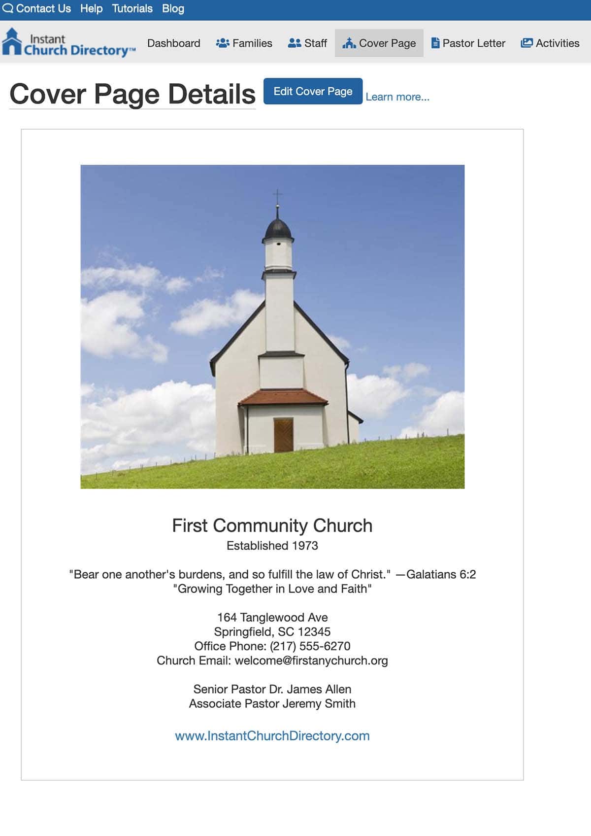
Even if you customize a separate cover for the church printed directory, use the cover feature in Instant Church Directory for the online version. That ensures the best viewing experience for people who access the publication via phone or computer, whether iOS or Android. By letting the app handle formatting behind the scenes, you don’t have to worry about screen orientation, resolution, cropping problems, cutoff text, or distorted images.
Tips for Effective Church Photo Directory Covers
The built-in cover feature on the Instant Church Directory app turns your photo into a professional-looking cover. No graphic design software or advanced technical skills are necessary! Here are some pointers for selecting cover images.
Because a photo directory cover indicates what a congregation is like, try to reflect the church’s personality and values. Choose attractive images that represent the congregation; for example, you can highlight worship, fellowship, or outreach. What do you want to convey to members who flip through the publication regularly—and to new families who open it for the first time?
For a strong directory cover, balance an eye-catching photo with clear, uncluttered details about the church. The best covers are welcoming and simple, with just a few written elements. Provide the church name and year (or season or edition); for example, “2026 Church Directory.” Also include church contact information, but limit that to the physical address, phone number, and website.
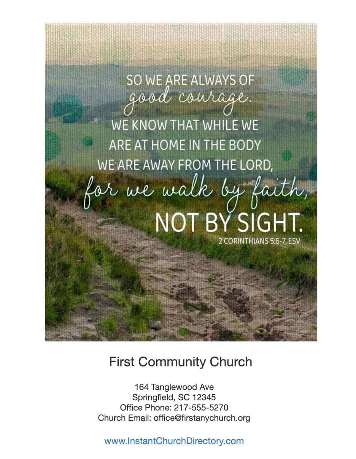
With Instant Church Directory, you can add your church website URL, driving traffic to your site. There, people can learn more about your ministry and programs. Some churches prefer to add a short mission statement or tagline on a photo directory cover. This works best when the photo doesn’t fill the entire cover.
To reduce visual clutter, don’t fill the space with additional details. Pastor names and phone numbers, staff listings, lay leaders, ministries, and committees all work better on inside front pages. The same is true for congregational instructions about updating directory entries and submitting prayer requests.
See What’s Possible for a Church Directory Cover
With Instant Church Directory, the front-page space is dynamic and flexible. Rather than being limited to fixed dimensions, you have the flexibility to adapt a cover photo. See what the built-in cover feature can do with your photos:
1. Full-page photo
For a minimalistic yet impressive church directory cover, use one large, vertical photo plus the church name and year. This layout packs a punch, because the image fills the entire available width, but viewers won’t feel overwhelmed.
2. Photo collage
A directory cover that combines three to five images represents the church effectively. This type of front space is perfect for churches that have many or diverse ministries. Pro Tip: Make sure all images are of equally high quality.
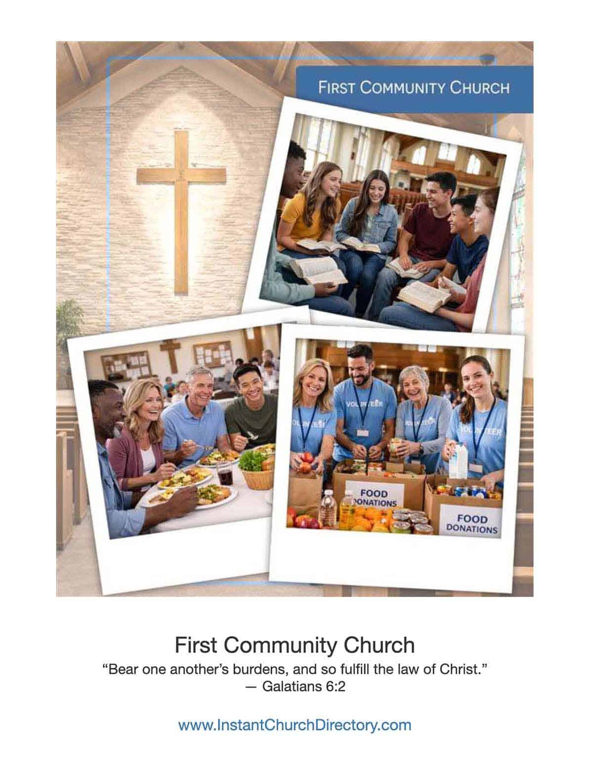
3. Full-page congregational photo
If your congregation is smaller or regularly gathers for a group portrait, try to include most members in a cover directory photo. Smiling faces convey a happy community of believers.
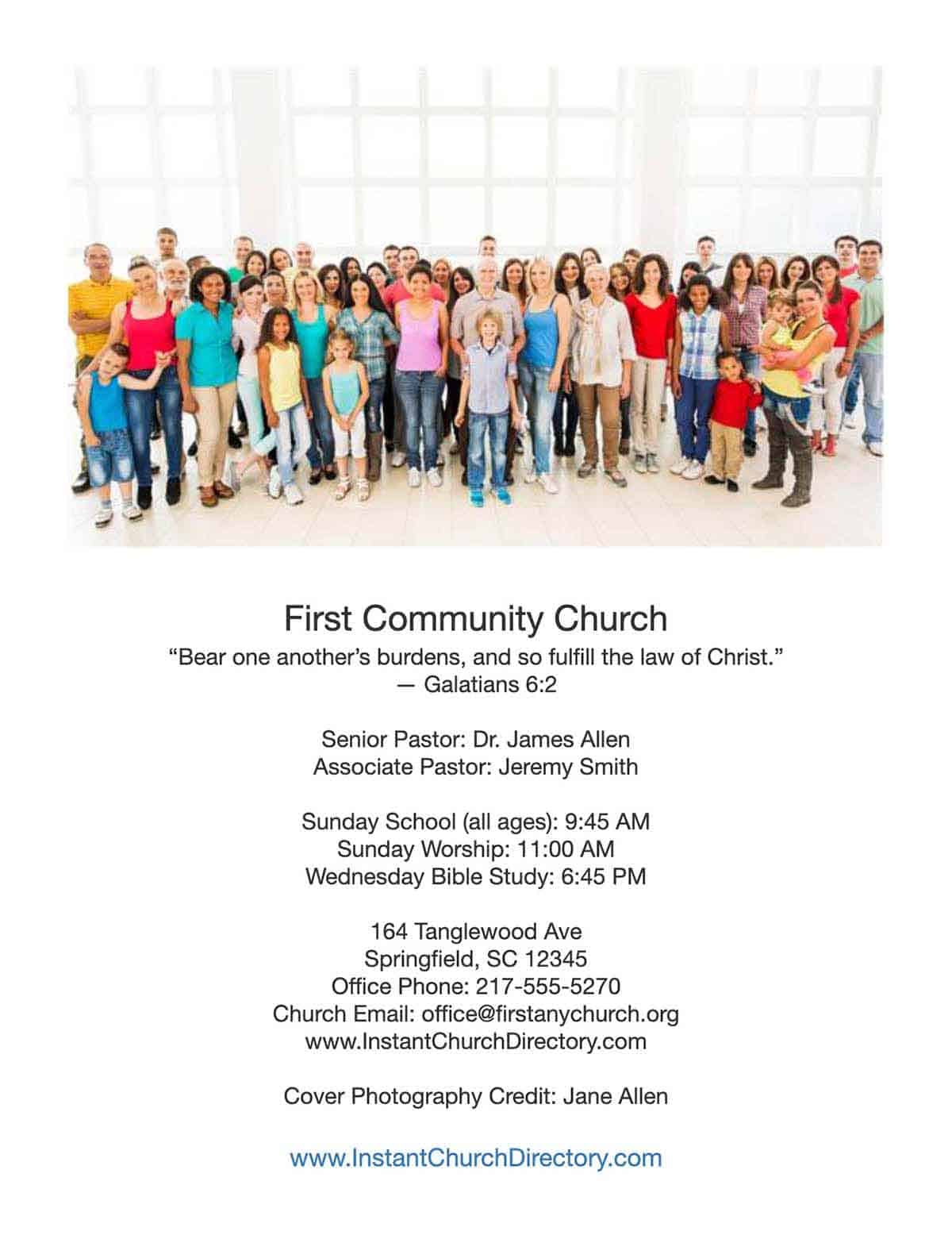
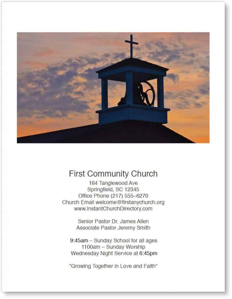
4. Full-page building photo
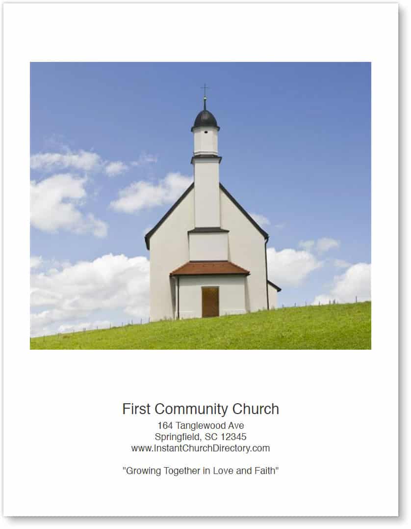
For this classic choice, use a vertical photo of the church’s exterior that features good lighting. Then leave a small text area for the church name, year, and key contact information. Covers showing the church building work best for established or traditional churches — or for those with distinctive features. They’re also a favorite for church anniversaries and print directories.
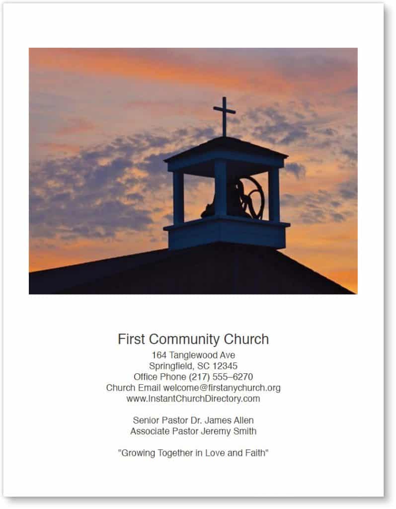
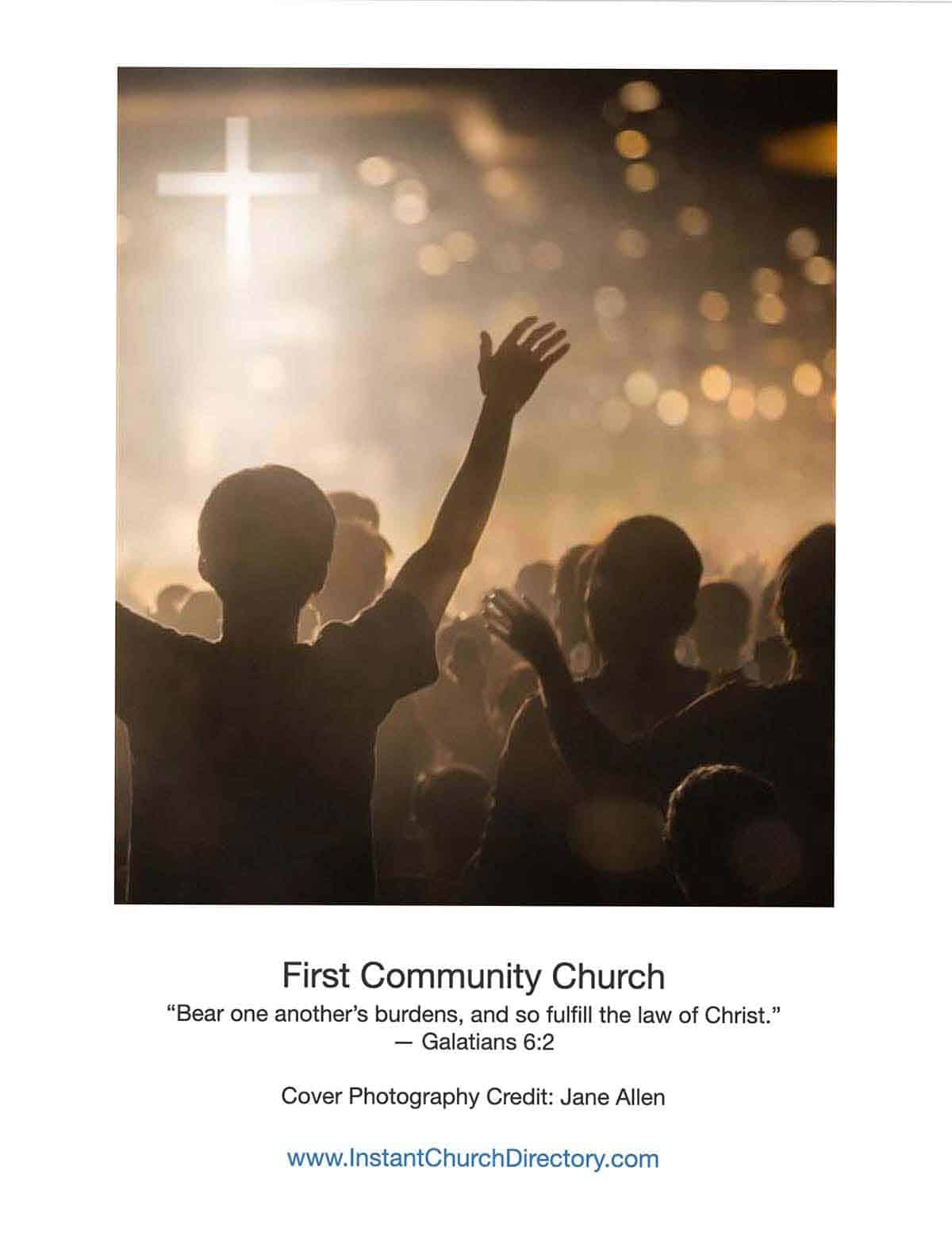
5. Worship photo
To convey the power of worship, use a high-quality image of musicians, communion elements, or raised hands. Before showing people on the cover, be sure to obtain permission.
6. Active young members
To portray a vibrant congregation, include a joyful image from the children’s ministry, vacation Bible school, or a family event. Pro Tip: Some parents might not want their children’s faces on the cover, even for a password-protected online directory. So seek permission or show a crowd of kids from the back.

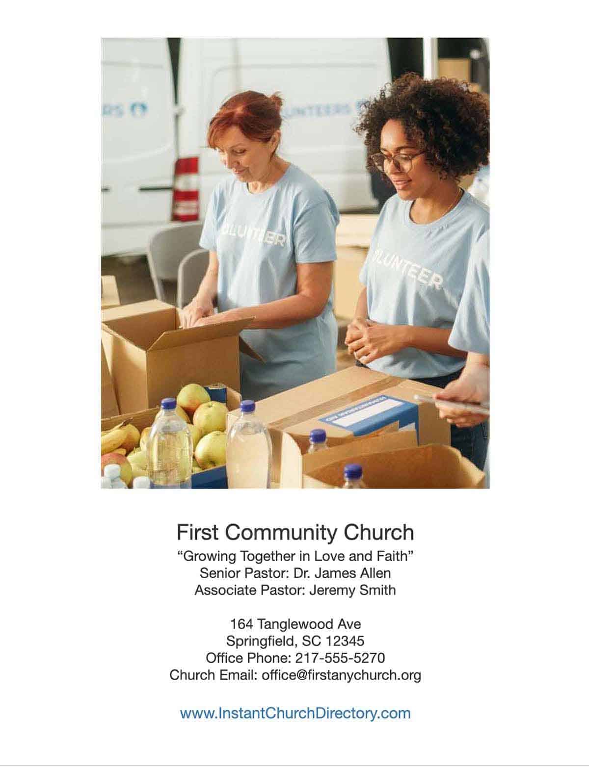
7. Community and outreach
Showcase photos of your church serving the community. Images from food drives and mission projects communicate that your congregation is about more than just Sunday gatherings. Again, obtain permission before using photos of faces, especially closeups.
Best Photos for a Church Directory Cover
Although photos are a great choice for directory covers, not every photo works well in that spot. If you’re planning to take new pictures for your directory, you may also find our tips for taking professional church directory photos helpful. Here’s what to look for:
- Lighting — Natural light creates the best results, so take photos outdoors or near windows. Avoid harsh shadows and overly dark images.
- Clarity and resolution — For the directory cover, use sharp, high-resolution images. Steer clear of anything that looks blurry, pixelated, or heavily filtered.
- Simple — Choose photos that have a clear focal point. Busy backgrounds distract viewers and compete with the text.
- Composition — Watch for faces that are too small and heads that are cut off. Don’t chop off crosses or other architectural elements. Crop intentionally from the top and bottom, not just from the sides.
Cover Image Size
The built-in cover feature of Instant Church Directory allows flexible photo sizing. But for the best results, follow a few guidelines.
For printed directories, use at least 300 DPI so the print quality is nice and clear. Ideally, start with a large image that’s at least 2,000 pixels on the longest side. Vertical images usually work best for full-page directory covers. Reserve landscape (or horizontal) images for covers that need a bit more text. Before finalizing images, always preview the directory cover on screen and in print.
Mistakes to Avoid with a Photo Directory Cover
DON’T overcrowd the cover with too much text. Just because you can add more text doesn’t mean you should! When cropping, don’t stretch or distort images. Avoid low-resolution or outdated photos, which can make the directory appear less polished or outdated. Don’t shrink images so much that people become unrecognizable.
DO use high-quality, well-lit photos for a church directory cover. Keep text minimal and legible, leaving plenty of white space for readability. Crop carefully and intentionally. Preview a photo-based cover before publishing or posting.
FAQs About Church Photo Directory Covers
Q: Can we change our directory cover later?
A: Yes! Instant Church Directory makes it easy to update the cover without having to redo other pages or layouts.
Q: Should our church use the same cover every year?
A: Many churches refresh annually to reflect growth, seasons, or ministry focus.
Q: Which is better: church directory cover templates or custom designs?
A: Templates are simple and consistent, and they work great for online directory covers. The built-in cover feature of Instant Church Directory saves you time and hassles. Custom designs work well for printed directories, especially if you have a design background.
Your church directory cover tells a story before anyone opens the publication. Instant Church Directory helps you easily create a vibrant cover that reflects your congregation and makes members feel proud to belong.

