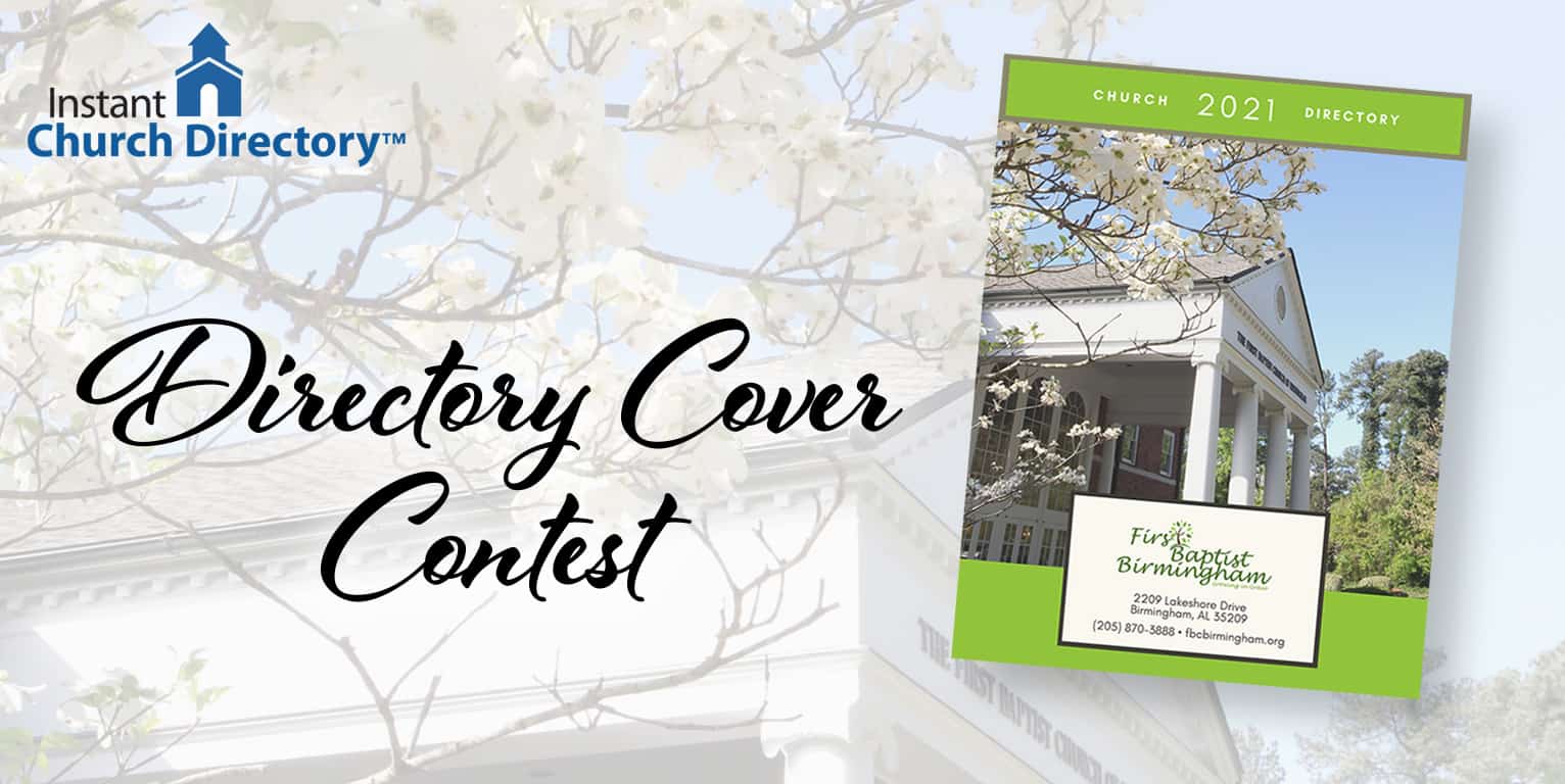
We recently asked members to submit their beautiful church directory covers for a chance to win a free year of Instant Church Directory. Not only were we blown away by the number of covers submitted, but choosing a winner was much tougher than we expected!
We could go on and on about the carefully thought-out layouts and photos we had the privilege of viewing. So many of these covers beautifully reflect each congregation, incorporating distinct features to highlight what makes the church special.
After a week of reviewing, appreciating and voting, here are the top 3 winners. (Keep reading to see other covers worthy of Honorable Mention!)
First place: First Baptist Church of Birmingham, Alabama
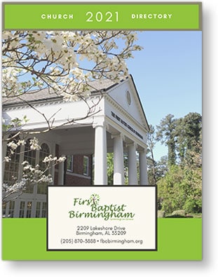
First Baptist Church of Birmingham takes a fun, colorful approach to a traditional Church Directory cover layout. It can be hard to take a photo of the building that doesn’t look flat, so we love how it’s softened with the dogwood tree “frame” and the light blue sky.
We also like the church logo’s green color and how the logo is incorporated into the cover design.
Finally, positioning the year along the top pulls the whole design together in a fresh, modern way while maintaining a traditional feel.
Second place: College Park Covenant Church of Saskatoon, South Dakota
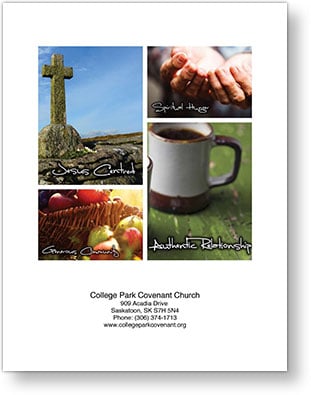
College Park Covenant Church takes a creative, thoughtful approach to selecting cover photos. The collage images reveal what the church is really about — and emphasize that it’s not just a building.
After creating a collage of images with a white frame, this cover’s designer imported it into the Instant Church Directory template to create the bottom portion using our feature. To make the church name stand out a bit more, it’s in a larger font than the address and contact information.
Third Place: Wetaskiwin Mission Church of Wetaskiwin, Alberta, Canada
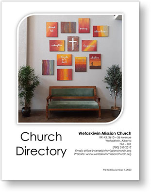
This year, Wetaskiwin Mission Church’s directory administrator decided to feature artwork from the youth group girls rather than a graphic from an online subscription. The photo shows the artwork people see as they walk into the building, something the church family loves. We appreciate this fun way of incorporating unique aspects of the church into the directory — especially because it highlights the creativity of kids.
We also like the “Printed” date and the right-justified format of the church information, which is a nice change from the traditional centered approach.
Honorable Mention: Wildermere Beach Congregational Church of Milford, Connecticut
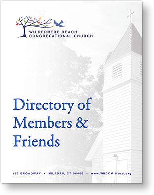
Because the “Directory of Members & Friends” from Wildermere Beach Congregational Church was only one vote behind third place, we feel compelled to give it a well-deserved Honorable Mention.
The carefully faded photograph in the background and the layout of the logo, cover name and contact information all are executed very professionally. We also love that people who frequently attend the church but may not be members yet are called friends!
Favorite Use of Photography in a Church Directory Cover
So many beautiful churches are represented on so many covers. But we kept coming back to Rocky Bayou Baptist Church and St. Elmo Presbyterian Church. Both covers use surrounding trees to frame the building photo, adding a unique perspective.
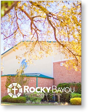
Rocky Bayou’s choice to make the photo the full page and include only the church logo at the bottom gives it a very professional, polished feel. The cover also has a great WOW factor, especially as an emailed PDF when it is first opened.
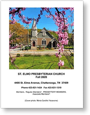
With St. Elmo’s photo, you can almost smell the fresh spring day! The image is very clean, with lovely framing of the church and flowers. Just look at the pop of pink against that marvelously blue sky!
Favorite Use of Instant Church Directory’s Template
One of our favorite things about this contest is seeing how many subscribers use the Instant Church Directory cover template to create stunning covers.
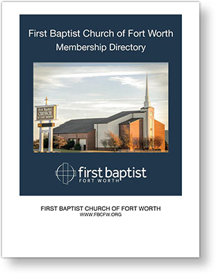
First Baptist Church of Fort Worth, Texas, created a navy-blue border with the church logo and name before uploading into the Instant Church Directory online template. The dark border really enhances the photo and makes the church logo pop!
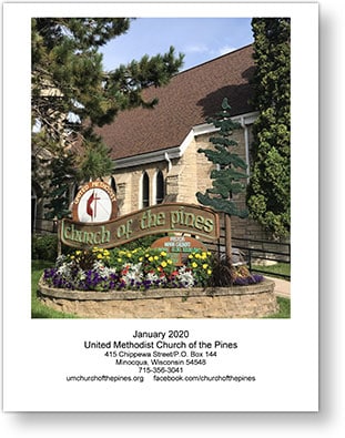
United Methodist Church of the Pines in Minocqua, Wisconsin, imported a nice photo of the church sign and building, and the cover looks fantastic! We also really like the placement of the directory date above the church information.
Best Use of Clipart on the Cover
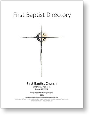
There’s something classic about this cover from First Baptist Church of Emery, South Dakota. Although the image is a simple clip-art cross, centered and dominant on the page, it’s very powerful. This cover also would work well in color on white paper, or in black-and-white on color paper. The options are endless!
We also applaud the skillful use of different font sizes and typography to fit lots of information on the cover. Balance is maintained, and the details don’t feel overwhelming.
Best Use of Incorporating Members’ Photos into a Directory Cover
Featuring actual members on a church directory cover is a fantastic way to show who really makes up the church! These are our favorite two covers that incorporate members* and activities.
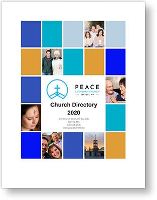
Peace Lutheran Church of Barrett, Minnesota, uses a fun, modern approach. Our favorite feature is the way this cover incorporates different photos of members* into a simple yet fun design.
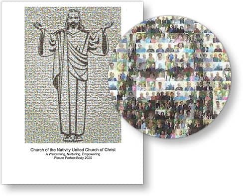
Church of the Nativity United Church of Christ of Buffalo, New York, created an outline of Jesus that has each of the directory photos embedded within it. Every photo is repeated numerous times to complete the image — how cool is that? The church reports that this cover has been well received by members, and we can see why!
*Images of members have been changed to generic stock photos from our sister publication, ChurchArt.com, to protect individuals’ privacy.
Favorite Booklet Design Directory Cover
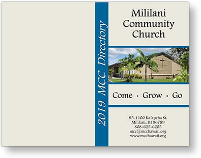
Mililani Community Church of Mililani, Hawaii, uses a booklet for its church directory. What a stunning design! The vertical border featuring the year is a nice touch, as is the blue border around the church photo and mission statement.
Other Fun and Creative Ideas for Directory Covers
Out of all the stunning covers we saw, here are a few featuring clever ideas we just have to share!
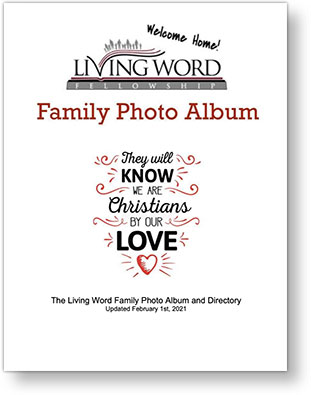
The Living Word Fellowship of First Redeemer Church in Cumming, Georgia, calls its Church directory a “Family Photo Album” — one of our favorite titles!
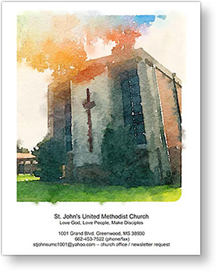
St. John’s United Methodist Church of Greenwood, Mississippi, uses a beautiful watercolor image of the church building. The way the ink “bleeds” out a bit into the white space creates a soft edge to the photo frame.
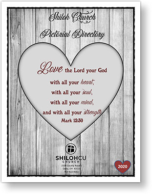
We love the idea of featuring a Scripture verse on a directory cover, as Shiloh Church of Delma, Ohio, does! Making the Scripture dominant and placing the church logo underneath is another great cover idea. The little heart in the corner featuring the year is a nice touch!
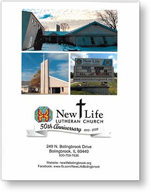
New Life Lutheran Church of Bolingbrook, Illinois, has something to celebrate, and we love that its anniversary is featured on the church directory cover! Creating a collage of multiple angles of the church and its sign is a great way to showcase the whole church.
We thank everyone who took the time to send their covers to us. It was our delight to see how you are using your church directory as an important resource as evidenced by the quality and creativity of your church directory covers. We hope that sharing them here will provide inspiration for those who may just be starting on the journey of creating and utilizing a church directory.

