
The cover of a photo directory is prime real estate. In other words, it offers your church a high-visibility opportunity to showcase itself and to share key information. The cornerstone of every cover is a photo (or photo collage), sometimes of the church building and sometimes of congregational faces and activities.
Now that Instant Church Directory has updated the front-page space to be more dynamic, users aren’t limited to images of a fixed size and width. That means you have much more flexibility and can adapt the cover image to fit your church’s particular needs.
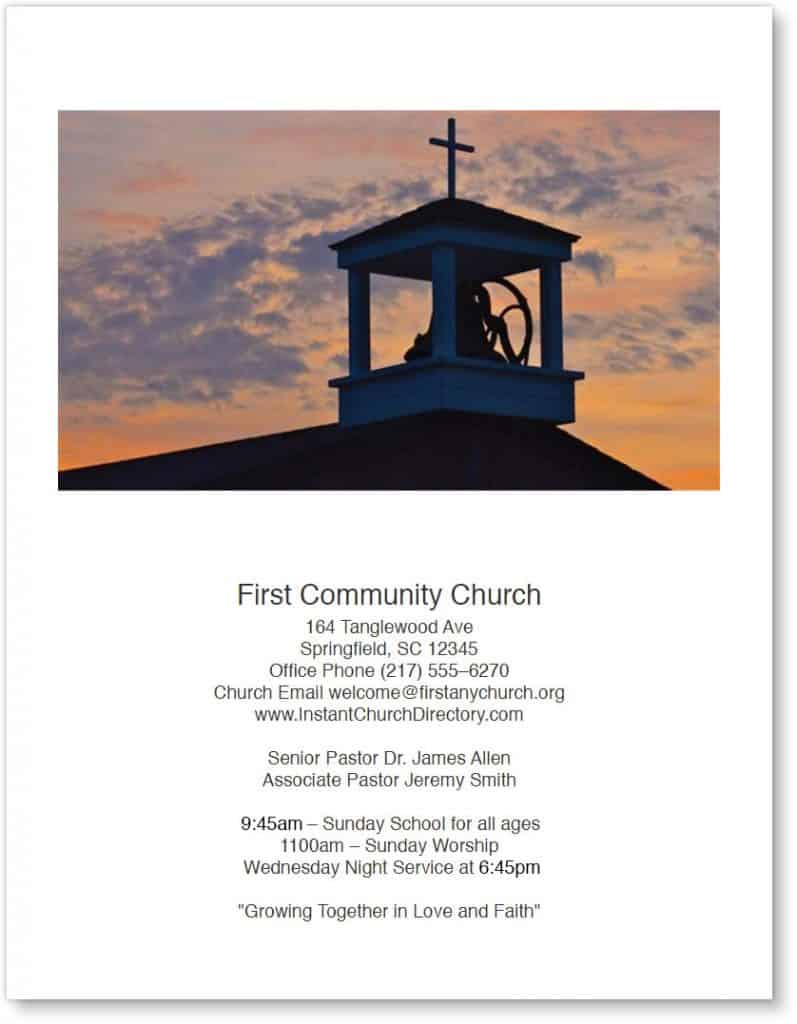
Here are some examples of how to maximize space when using photos on your church’s pictorial directory:
1. A full-page photo
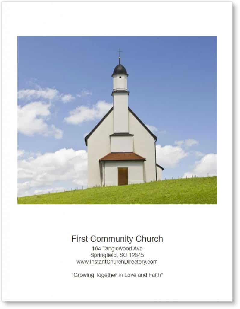
A traditional Instant Church Directory cover features one large, vertical image, typically with a small space for text underneath. That area below the photo is ideal for listing church contact information and maybe a mission or purpose statement.
As this sample shows, there’s not a lot of text, which allows the photo to fill the maximum available width.
With Instant Church Directory’s new dynamic front-page tool, you can add more lines of text without the risk of cutting off any words. However, it’s important to note that as you add lines, the image itself will gradually become smaller. So you’ll need to keep an eye on that. Aim for a cropping ratio that looks visually pleasing, making sure that no essential parts of the photo are eliminated.
2. A cropped photo
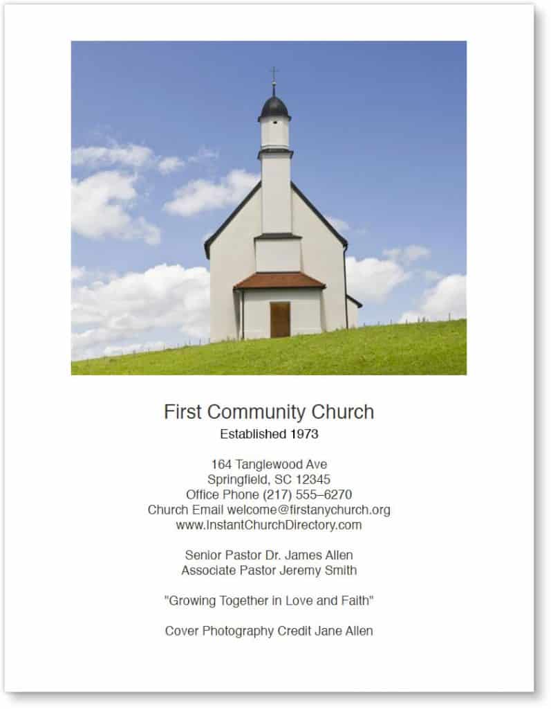
In this example, that same photo of a church building has been cropped. Now you’ll notice that the left and right sides of the photo don’t go all the way to the edge of the directory cover.
Pro Tip: As you crop, remember to crop the tops and bottoms of the photo too. An image won’t be effective if it’s distorted or if features and faces are too small to identify.
3. Uncropped, with even more text
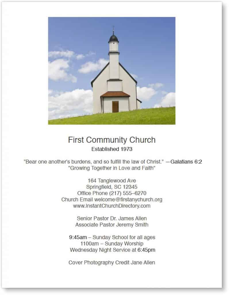
When you prefer to have as much as — or more — text as you do artwork on a directory cover, start with a photo that looks attractive at a smaller size. This type of layout also might leave room for a decorative border or frame around the photo (or around the entire page).
A few words about … words: Just because you can now add as much text to the cover as you’d like, that doesn’t mean more text is always a good idea. Readers are less likely to pick up a publication with a text-heavy cover than one with a vibrant photo. So strive to keep the front of your photo directory aesthetically pleasing.
Limit text to the basics: church name, address, phone number, website address, pastors’ names, and maybe a short mission statement. If the church staff is large, list all those names on an inside front page. Other topics that work well there include names of elders or church leaders, committees and groups, ministries and programs, and Bible class and Sunday school teachers. Also let people know how they can share prayer requests, update their directory listing, and get involved in the church family.
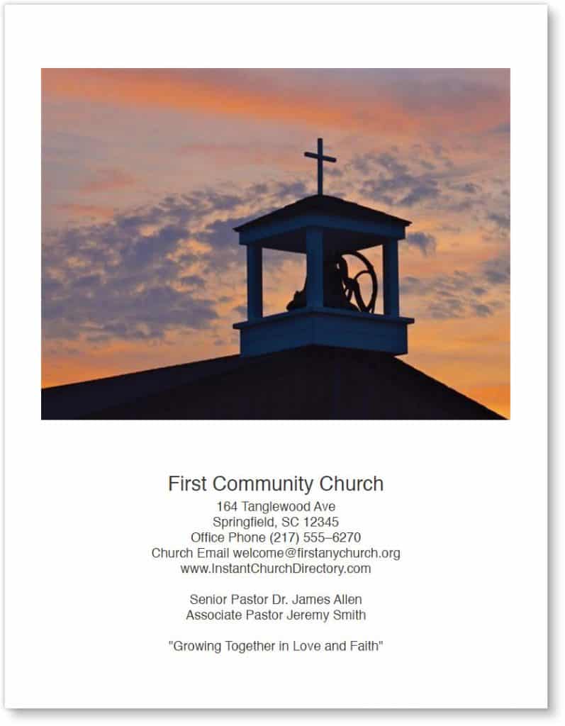
4. Crop top and bottom to maximize image and amount of text
If you plan to include quite a bit of text on the cover of your church photo directory, it’s best to select a landscape (horizontal) image. That way, as the artwork is enlarged or reduced, it essentially remains in widescreen format, without significant distortions. Removing more from the top or the bottom of the photo allows you to display more text.
Note that selecting just a portion of a widescreen image can result in a portrait — or vertical — orientation, depending on the shape of what you select. So for a ratio, be sure to maintain a shorter height than width.
The cover of your church’s photo directory gives an important first impression about the congregation. So it’s worth a few extra minutes to create an attractive cover that makes people proud to be included in the directory.